I actively failed an accessibility audit for a state government contract in 2020 because I used pure black #000000 text on a stark white background. The auditor told me that the contrast was actually too high, causing visual halation and severe eye strain for users with cognitive disabilities like dyslexia. I was forced to rewrite the global typography scale to use deep, heavy shades of the government's primary brand blue instead of black. It was a massive wake-up call regarding how professional designers actually use shades in production environments.
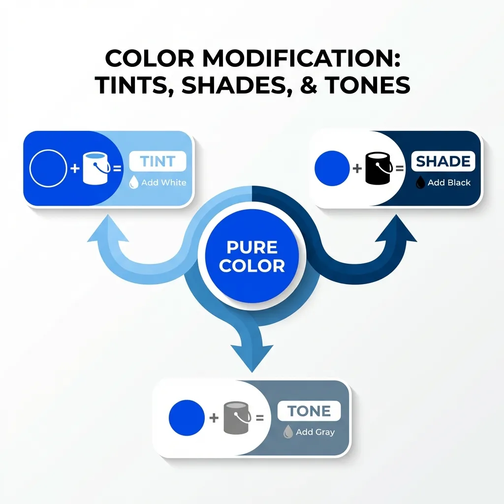
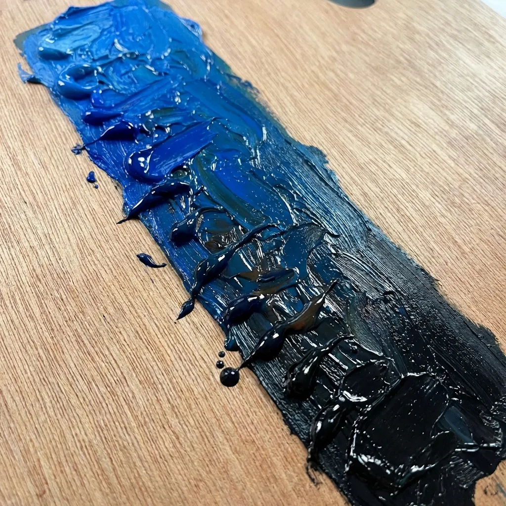
Most junior developers think a "shade" is just a synonym for any slightly different version of a color. That is mathematically incorrect. In strict color theory and CSS architecture, a shade is specifically your base hue mixed with pure black. It is the absolute foundation of professional UI typography and depth hierarchy.
The death of pure black
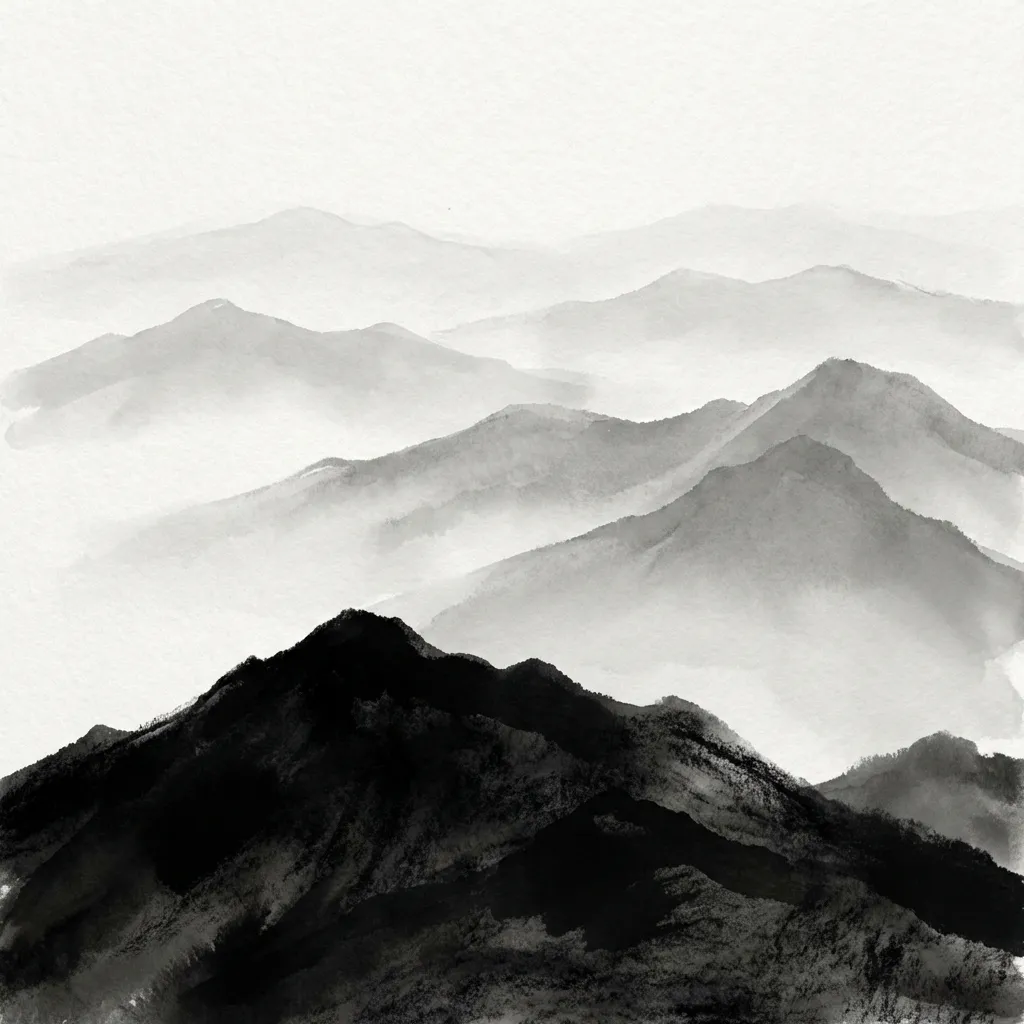
The dumb solution that works for making an interface look instantly more expensive and premium is completely banning the hex code #000000 from your stylesheet. Pure black does not exist in the natural world. If you look into the deepest, darkest shadow of a forest at midnight, it is not pure mathematical black. It is a very, very deep shade of green or blue.
When you use pure black text on a screen, it looks artificial, clinical, and aggressive. The secret to high-end UI design is using a "shade" of your primary brand color for your text instead. If your primary brand is a corporate navy blue (#1E3A8A), your body text should not be black. It should be an incredibly deep, 90% dark shade of that exact same navy blue (like #0F172A). It provides the exact same readable contrast as black, but it subconsciously ties the entire page together and feels incredibly soft and professional to the user's eye.
Generating shades mathematically
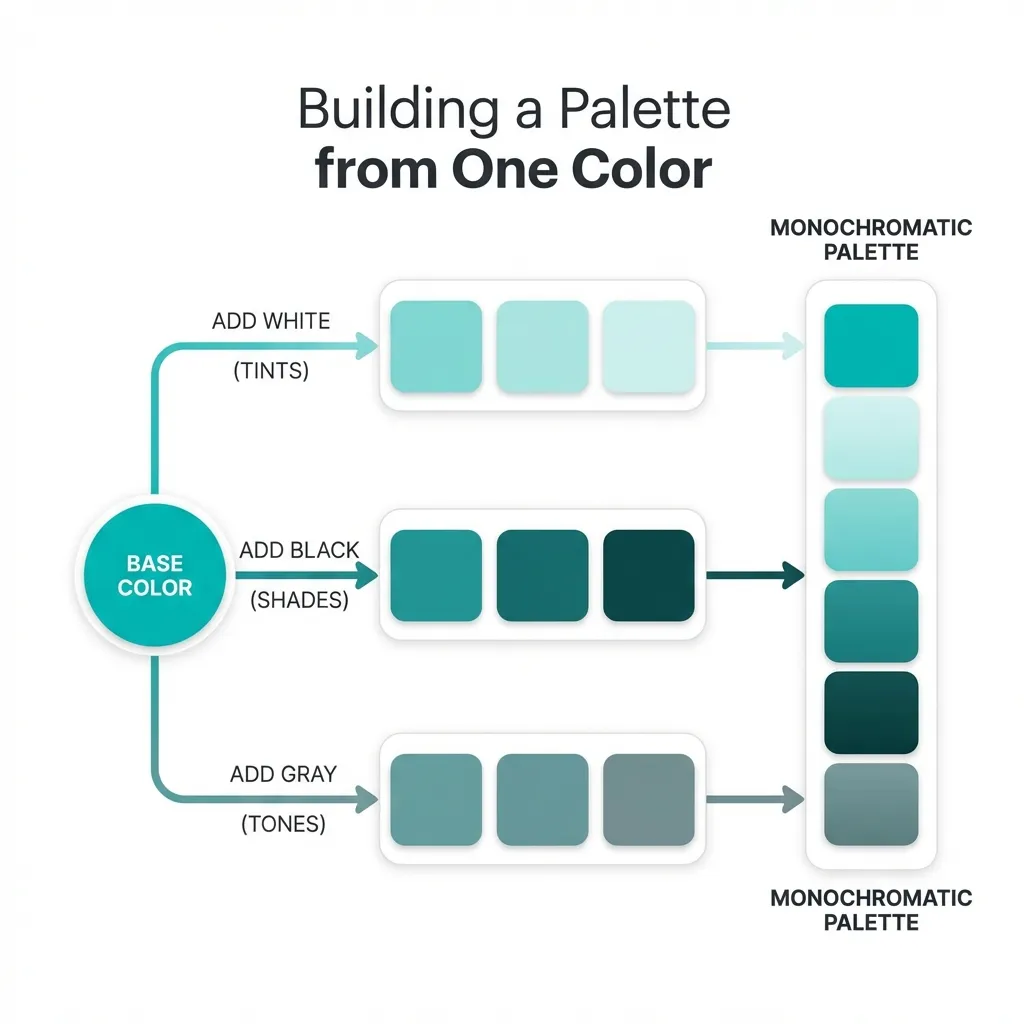
You cannot generate a proper shade by guessing with an eyedropper tool. You must use the HSL color model. If your base color is hsl(220, 100%, 50%), you create a shade by locking the hue (220) and the saturation (100%), and strictly dropping the lightness value.
I use very specific lightness steps for different UI elements. If I need a hover state for a button, I drop the lightness by exactly 10%. If I need an "active" or "pressed" state, I drop it by 20%. If I need a heavy, solid border for an input field, I drop it by 40%. The math completely removes the guesswork. You never have to wonder if the hover state matches the button; the math guarantees that it does.
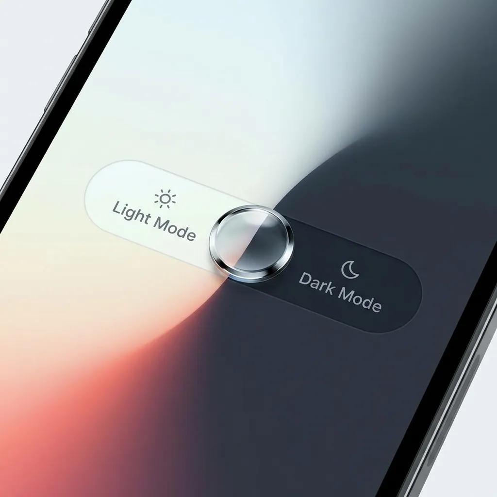
The dark mode inversion problem
Where understanding shades becomes absolutely critical is when you start building dark mode themes. A massive mistake developers make is trying to use their deep, heavy shades on a dark gray background.
If your primary button is a deep shade of crimson (#7F1D1D), it will look fantastic and authoritative on a white background. But if the user toggles dark mode, that deep crimson button will completely vanish into the dark gray background. There's no clean native solution to making a deep shade work in dark mode; the mandatory workaround is entirely inverting your palette logic.
In dark mode, you don't use shades (color mixed with black). You must use tints (color mixed with white). You have to create a completely separate CSS variable for the dark mode button that increases the lightness of the crimson so it glows against the dark background instead of hiding in it.
(I actually had to completely redesign a massive cryptocurrency trading dashboard because I didn't understand this rule. The traders physically could not see the "Sell" buttons in dark mode because the red shade was too heavy. It was an incredibly stressful weekend.)
Stop using opacity for shades
Finally, never use transparency (opacity) to create a shade. I see junior developers place a black box over a blue button and set the black box to 20% opacity to create a "shade." That is a massive performance drain on the browser's rendering engine, and it causes severe z-index stacking issues if the button overlaps anything else on the page.
Use native CSS color-mix() or strict HSL math to calculate the solid hex code for the shade. Let the browser render a single, solid color. It is faster, cleaner, and mathematically bulletproof.