When I was assigned to build an internal dashboard for a major logistics company in 2022, I made a classic junior mistake. I made the entire interface completely monochrome blue because I thought it looked clean and professional on my retina display. The client rejected it immediately during the first user testing session. The warehouse workers actively complained because they couldn't tell the difference between a "shipped" status and an "error" status at a glance across a dusty room.
UI color is not about making things look pretty. It is a strict information hierarchy system. If you are choosing colors based on aesthetics rather than utility, you are building bad software. Here are the concrete rules for selecting UI colors that actually work in production environments.
Start with semantic constraints
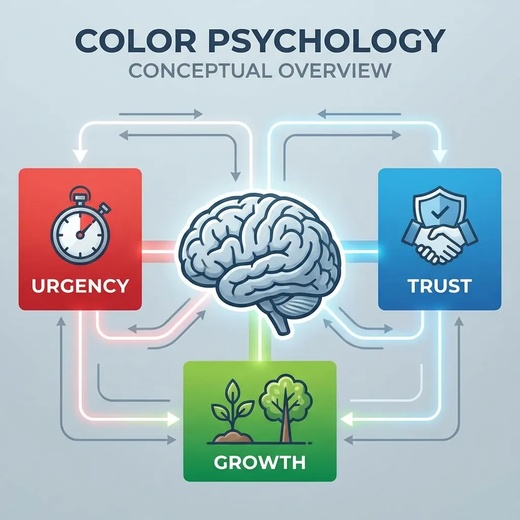
Most designers start their process by picking a brand color. That is entirely backwards. You should start by defining your semantic colors: success (green), warning (yellow or amber), error (red), and information (blue). These are the colors that will actually communicate state changes to your users.
The technical trick is matching the saturation and lightness of these semantic colors to each other so the interface feels cohesive. A very common mistake is using a hyper-saturated, neon green for success states right next to a muted, pastel red for error states. The visual weight becomes completely unbalanced. When I set up semantic scales for a new project, I use the HSL format and explicitly lock the saturation around 70% and the lightness around 50% for all four semantic states. That mathematical constraint ensures they all carry the exact same visual weight on the page.
You cannot use a red brand color for primary buttons. Red is semantically locked to destructive actions on the web. If you use red for a "Save Profile" button, users will hesitate. I actually lost a freelance contract in 2019 because I flatly refused to make the "Confirm Payment" button blood red for a client's e-commerce site. You cannot fight decades of ingrained user conditioning.
Contrast is mathematically non-negotiable
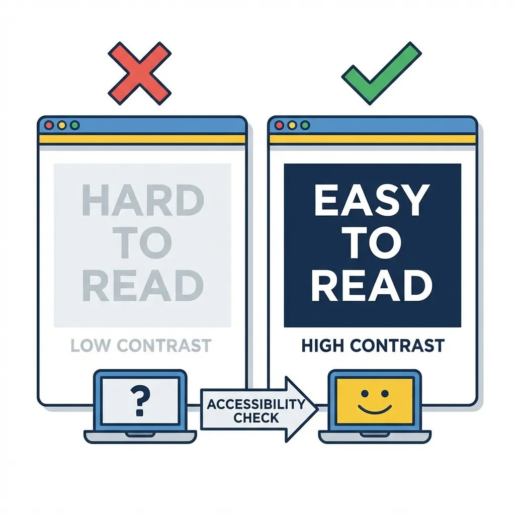
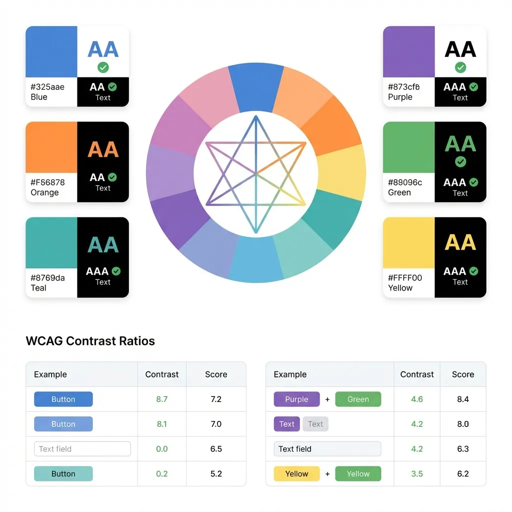
A button that fails WCAG 2.1 contrast checks is a broken button. Period. There is no debate. You need a strict 4.5:1 ratio for normal text and a 3:1 ratio for large text (over 18pt or 14pt bold).
I think relying on automated accessibility linters is the only way to enforce this at scale. If you rely on a designer's eye to catch contrast failures, you will eventually ship inaccessible code to production. I configure a contrast checker in my CI pipeline that automatically flags any CSS or Tailwind classes that violate WCAG AA standards. It fails the build before it ever reaches the user.
There's no clean solution to fixing a brand color that fails contrast on a white background; the workaround is usually a difficult conversation with the marketing team. If they hand you a light orange (#F97316) and demand it be the primary button text, you have to drop the lightness of that orange in HSL by at least 15% specifically for digital text applications. They rarely notice the shift, but visually impaired users absolutely will.

The dark mode inversion problem
Dark mode shouldn't just be pure black #000000 with white text. That creates a harsh halation effect for users with astigmatism, making the text look blurry and actively causing eye strain. Use a dark, heavily muted gray like #121212 for the background instead.
There is a massive problem with dark mode brand colors. If your brand color is a deep, authoritative navy blue, it will look fantastic on a stark white background. But if you try to use that exact same navy blue on a dark gray background, it will completely vanish into the shadows. You have to maintain two completely separate token variables: a "light mode brand color" and a "dark mode brand color." For the dark mode version, you typically have to drop the saturation slightly and increase the lightness significantly so it remains legible without burning the user's eyes.
(I once spent three weeks trying to automate this by algorithmically inverting colors based on the background layer, but the math just doesn't produce aesthetically pleasing results across the board.)
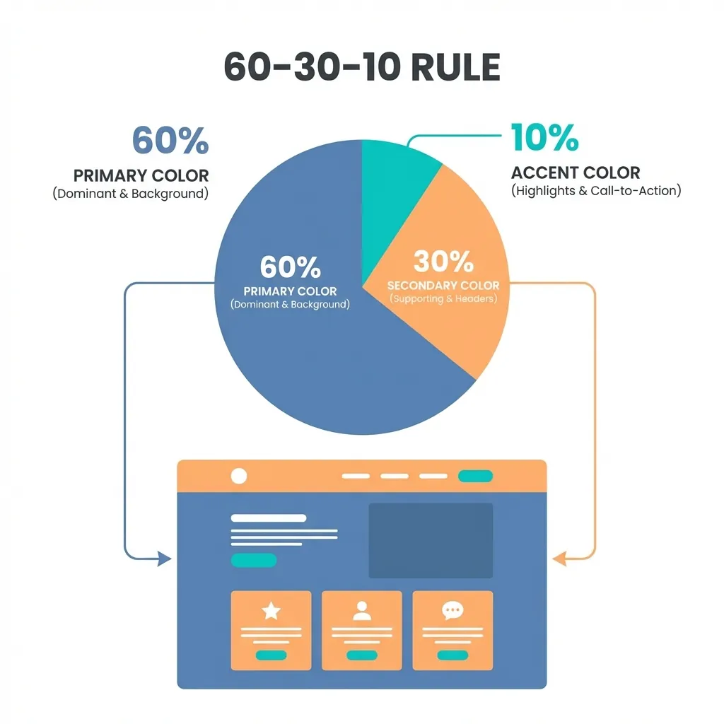
The 60-30-10 distribution rule
If you pick complementary colors (opposites on the wheel like blue and orange), you cannot use them equally on the screen. That creates a visual vibration that physically hurts to look at.
The dumb solution that works is the classic 60-30-10 rule. Your dominant neutral color (usually your background off-white or dark gray) takes up 60% of the screen. Your primary brand color (the interactive blue) takes up exactly 30%. Your complementary accent (the warning orange) takes exactly 10%. I think most bad, chaotic UI designs happen because the designer tried to make the accent color fight the primary color for attention.
Limit your total UI palette to about 8 to 10 distinct mathematical values. You need a primary brand color, four semantic colors, and a few structured shades of gray. Anything more than that is just unmaintainable tech debt masquerading as creativity.