Picking a cohesive website color scheme used to take me hours of staring blankly at Pinterest mood boards until I was too frustrated to actually write any code. I would randomly grab five beautiful hex codes from a design inspiration site, throw them into a global CSS file, and then spend two days wondering why the interface looked like a chaotic circus and the primary button text was completely unreadable.
The dumb solution that works is abandoning the idea of "picking" colors entirely. UI design is entirely math-based. You do not need a designer's eye. You need exactly one base color, a tinted neutral scale, and a strict, unyielding adherence to contrast accessibility ratios.
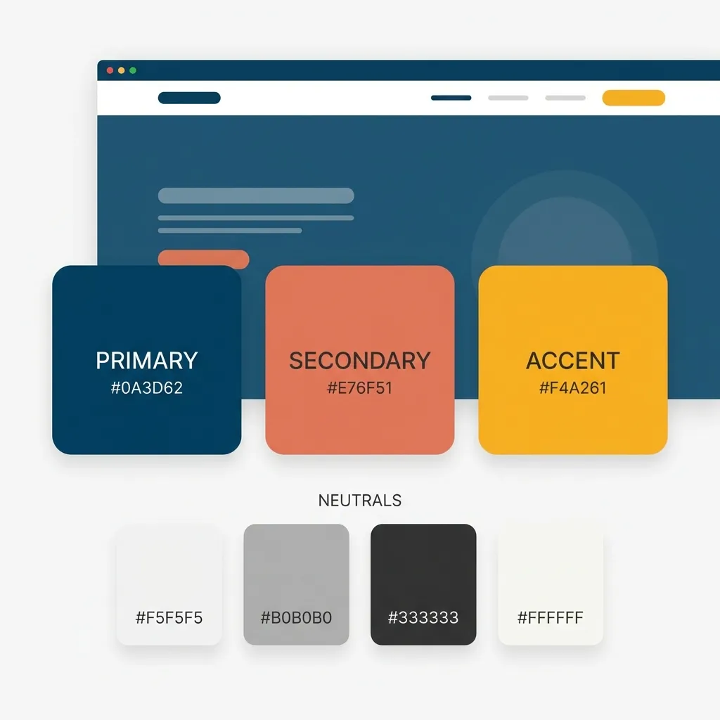
Start with a single, highly constrained hex code
Pick one primary brand color. Not three. Not five. Exactly one. I spent two entire days debugging a massive CSS file for a client agency in 2023 before I finally realized they had defined fourteen different "primary" blues in their Tailwind configuration file. It was an absolute nightmare to maintain, and the developers were just randomly guessing which blue to use on which component.
Pick a single hex value to anchor your entire application. If your brand is highly energetic and aggressive, maybe you grab a bright orange like #F97316. If it is a serious fintech dashboard, you probably want a deep, authoritative indigo like #4338CA.
Once you have that single hex code, stop picking colors. Generate your tints and shades algorithmically. I rely entirely on the HSL color model for this because it is perfectly predictable. You keep the Hue and Saturation exactly the same, and you just step the Lightness up and down in rigid 10% increments. This guarantees, without question, that every color in your application belongs to the exact same visual family.
Fixing your dead neutrals
Where this process gets weird is handling the neutrals. Most developers assume that grays should just be pure black mixed mathematically with pure white. That is a massive mistake. If you use a pure, mathematical gray (like #808080) right next to a vibrant primary color, the gray looks completely dead and clinical.
You have to inject a tiny bit of your primary brand hue into your grays to make them feel alive. If your brand is blue, give all of your grays a 2% or 3% blue saturation. It ties the entire interface together subconsciously.
(I actually built the ColorPickerCode generation tool to do this exact tinting process automatically because I was so incredibly tired of calculating HSL offsets by hand every time I started a new project.)
Contrast is your only real metric
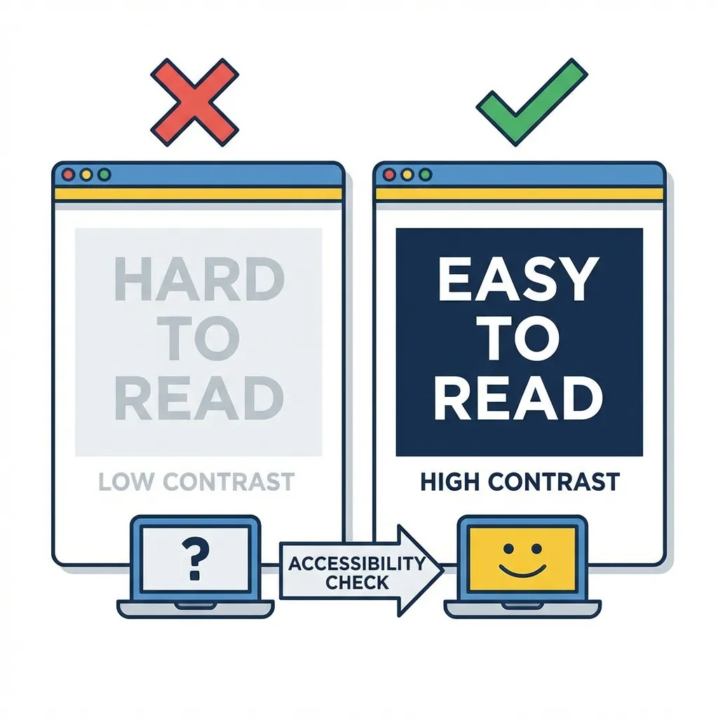
You can pick the most beautiful color palette in the world, but if it fails WCAG 2.1 contrast rules, your website is fundamentally broken. A beautiful UI that users cannot read is a failed UI.
I think automated contrast checkers will eventually solve accessibility at the compiler level, entirely preventing developers from shipping bad color combinations. But for now, you must manually check your ratios. You need a strict 4.5:1 ratio for any standard body text against its background. If your beautiful brand color fails that ratio, you cannot use it for typography. Period. There is no debate.
Stop browsing design galleries for inspiration. Just pick one core color, tint your grays with it, generate your hover states using 10% lightness steps, and aggressively verify the contrast math. The rest of the design will handle itself.