When I was a junior developer tasked with building a massive design system for a fintech dashboard, I thought building a cohesive color palette just meant picking a base color, adding white for the hover state, and adding black for the active state. I would randomly add white to a vivid yellow warning button and get a muddy, sickly beige that looked terrible on screen. I didn't understand why the math wasn't working, and my lead designer brutally rejected my pull request four times in a row.
Color theory isn't just about mixing physical paint on a canvas. In modern CSS architecture, understanding the exact mathematical difference between a tint, a shade, and a tone is what separates amateur, chaotic interfaces from professional, enterprise-grade design systems. If you use the wrong operation, you actively destroy the accessibility and the visual harmony of your application.
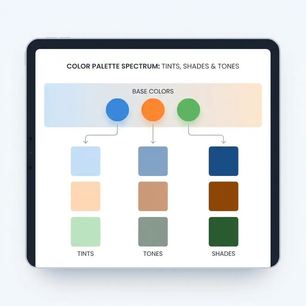
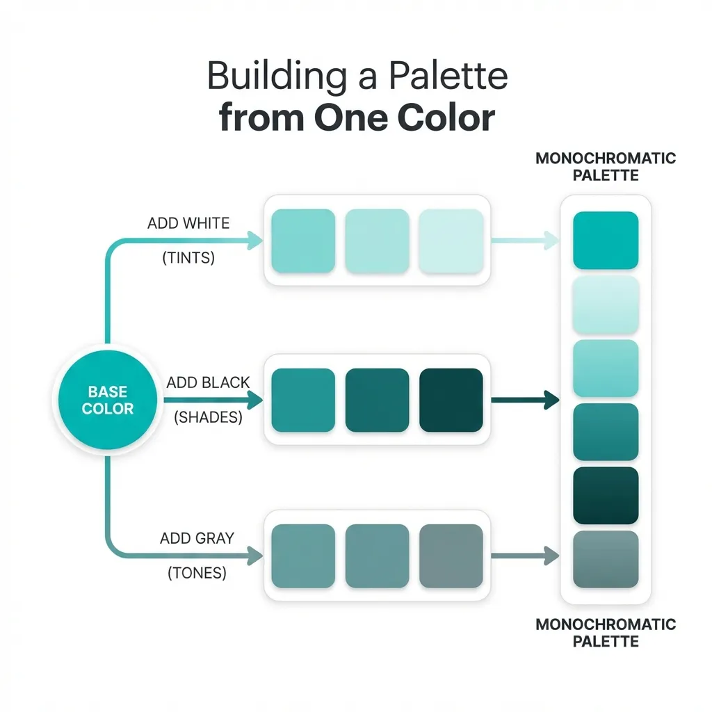
Tints: Systematically adding white
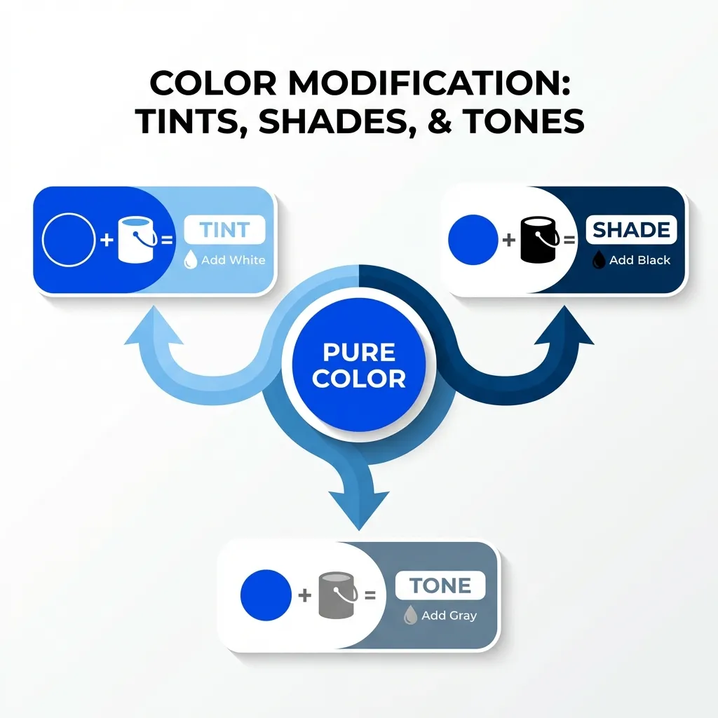
A tint is strictly defined as your base hue mixed mathematically with pure white. It increases the overall lightness of the color while simultaneously decreasing the visual saturation. Tints feel airy, lightweight, and completely unintrusive.
In modern CSS, the dumb solution that works perfectly for generating tints is using the HSL (Hue, Saturation, Lightness) color model and simply cranking up the lightness value. If your base corporate brand color is a solid blue like hsl(220, 90%, 50%), a proper tint would be hsl(220, 90%, 90%).
You use tints extensively for background colors behind alert messages, subtle hover states on light-themed websites, and the backgrounds of secondary information badges. They provide a clear, undeniable hint of color without dominating the visual hierarchy or distracting the user from the primary call to action. I think developers massively underuse tints; a 95% lightness tint of your brand color makes a vastly superior application background compared to a stark, blinding pure white.
Shades: Grounding the interface with black
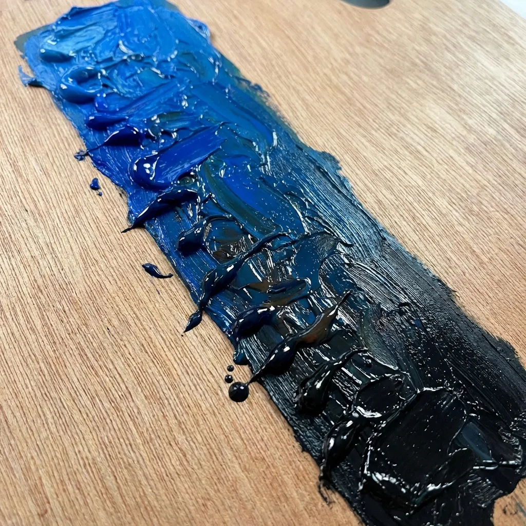
A shade is the exact mathematical opposite of a tint. It is your exact base hue mixed with pure black. It drastically decreases the lightness value while maintaining the core hue identity. Shades feel heavy, grounded, highly authoritative, and permanent.
To create a true shade in HSL, you simply drop the lightness value significantly. hsl(220, 90%, 15%) is an incredibly deep, heavy shade of that exact same corporate blue. You use shades for primary body text, heavy structural borders, and deeply pressed active button states.
(I actually exclusively use extremely deep shades instead of pure black for typography across all of my client projects. A dark, 15% lightness navy blue reads significantly softer on the user's eyes than the jarring, migraine-inducing contrast of pure #000000 black, while still easily passing all strict WCAG 2.1 accessibility audits.)

Tones: The hardest concept to master
Toning is undeniably the hardest concept to teach junior developers. A tone is your base hue mixed with pure gray (which is, by definition, a combination of both black and white). It actively decreases the saturation of the color without necessarily altering the core lightness value. Tones feel muted, highly sophisticated, complex, and modern.
There is absolutely no clean, algorithmic solution for generating perfect tones automatically in vanilla CSS without relying on advanced relative color syntax; the standard workaround is manually adjusting the saturation value in HSL until it optically looks correct to the human eye. If you have that same bright blue at hsl(220, 90%, 50%), dropping the saturation drastically down to hsl(220, 30%, 50%) gives you a beautifully muted, slate-blue tone.
I think the absolute biggest mistake amateur designers make is attempting to build an entire interface out of pure, highly saturated, untoned hues. It makes the software look like a child's Fisher-Price toy. You absolutely need tones to balance the interface. If you use a muted, toned-down slate-gray for your application's sidebar backgrounds, your highly saturated primary "Save" button will actually stand out and command attention because it isn't fighting the background for visual dominance.
Implementing this in CSS Variables
You cannot effectively use tints, shades, and tones if you are randomly guessing hex codes in an eyedropper tool. You must lock this math into your CSS variables.
A professional architecture defines the base hue globally: --brand-hue: 220; and --brand-sat: 90%;. From there, you map out your exact lightness steps. Your primary button becomes hsl(var(--brand-hue), var(--brand-sat), 50%). Your light background tint becomes hsl(var(--brand-hue), var(--brand-sat), 95%). Your dark typography shade becomes hsl(var(--brand-hue), var(--brand-sat), 15%).
By relying entirely on HSL math instead of raw hex codes, you guarantee that every single tint, shade, and tone in your entire application belongs to the exact same mathematical family. Stop guessing with the color picker and start doing the math.