I genuinely thought I was supposed to use a physical, printed color wheel when I first started learning UI design. I actually went to an art supply store, bought a cardboard wheel, and spun the little dial around trying to find the perfect complementary color for a client's website. It was completely useless. By the time I actually mapped the physical paint color back into a digital hex code, the color was muddy, desaturated, and completely failed every accessibility contrast test imaginable.
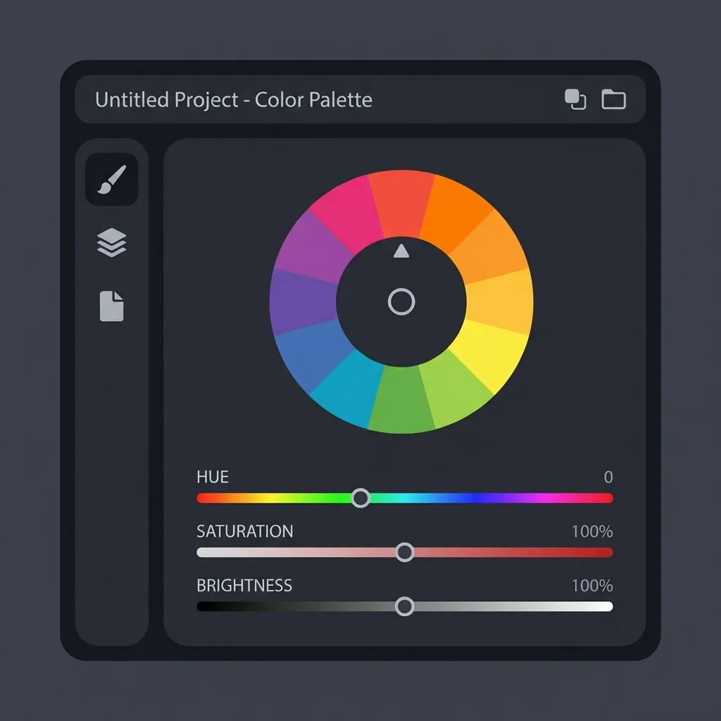
Professional web developers do not use color wheels. They use color math. Specifically, they use the HSL (Hue, Saturation, Lightness) color model, which is essentially just a mathematical representation of a color wheel built directly into the CSS language.
The absolute basics of HSL math
The "H" in HSL stands for Hue, and it is measured in degrees from 0 to 360, exactly like a physical circle. Red is at 0 degrees. Green is at 120 degrees. Blue is at 240 degrees. If you want a red button, you write hsl(0, 100%, 50%). If you want it to be blue, you don't drag a cursor around a visual picker. You simply change the math to hsl(240, 100%, 50%).
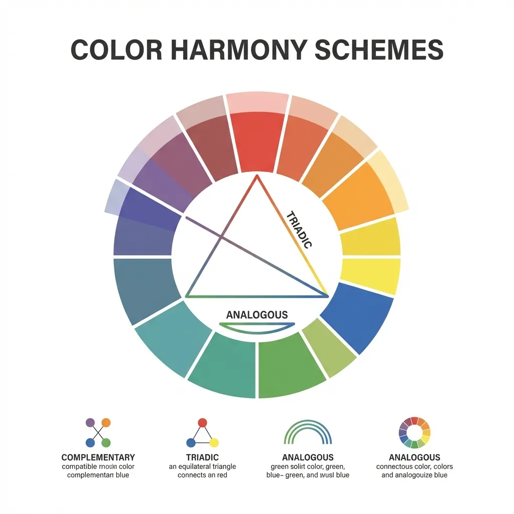
The dumb solution that works for finding a complementary color (the exact opposite color on the wheel) is simply adding or subtracting 180 from your current hue value. If your brand is a vibrant orange at hsl(30, 100%, 50%), the mathematically perfect complementary color is hsl(210, 100%, 50%). You don't have to guess. You don't have to look at a chart. You just do basic third-grade addition.
I think the absolute biggest mistake junior developers make is trying to build a triadic color palette (three colors spaced evenly around the wheel) by eyeballing it. If you have a primary hue at 0, your triadic colors are exactly at 120 and 240. The math guarantees maximum visual separation and perfect mathematical harmony.
The 60-30-10 distribution rule
Finding complementary colors using math is easy. Applying them to a user interface without causing physical eye strain is incredibly difficult. If you take a bright orange button and place it on a bright blue background (perfect complementary colors), the edges will visually vibrate. It is physically painful to read.
The strict rule for applying a color wheel palette to UI is the 60-30-10 distribution. Your dominant color should take up roughly 60% of the screen. This should almost always be a heavily desaturated neutral color (like a white or dark gray background). Your secondary color takes up 30%. Your complementary accent color—the high-contrast opposite from the color wheel—must be restricted to an absolute maximum of 10% of the screen.
If you use your complementary color for anything more than primary call-to-action buttons, notification badges, or thin active-state borders, you will overwhelm the user. (I actually lost an entire freelance contract because I made a website's navigation bar bright orange to contrast with the blue background. The client said it looked like a Halloween decoration. They were right.)
The danger of automated color generators
There's no clean native solution to finding a truly accessible color palette using a standard color wheel; the mandatory workaround is manually adjusting the lightness and saturation values after the math gives you the hue.
If you use an automated color wheel generator to find the complementary color for a deep navy blue, the algorithm will mathematically spit out a dark brown. Technically, that is the exact opposite on the wheel. Functionally, it is useless for UI design. Dark brown on dark navy blue is completely unreadable.
You have to decouple the hue from the lightness. Use the color wheel math (adding 180 degrees) strictly to find the hue value. Once you have the hue, you must manually adjust the saturation and lightness to ensure it passes WCAG 2.1 contrast rules. If your primary brand is dark blue, your complementary action button must be a highly saturated, incredibly bright orange to stand out. Let the math find the family, but let contrast accessibility define the final output.