I stubbornly kept typing #000000 for all of my body text until a senior developer pulled me aside during a code review and told me I was actively causing our users eye strain. "Pure black text on a pure white background is for Microsoft Word documents, not modern web applications," she told me bluntly.
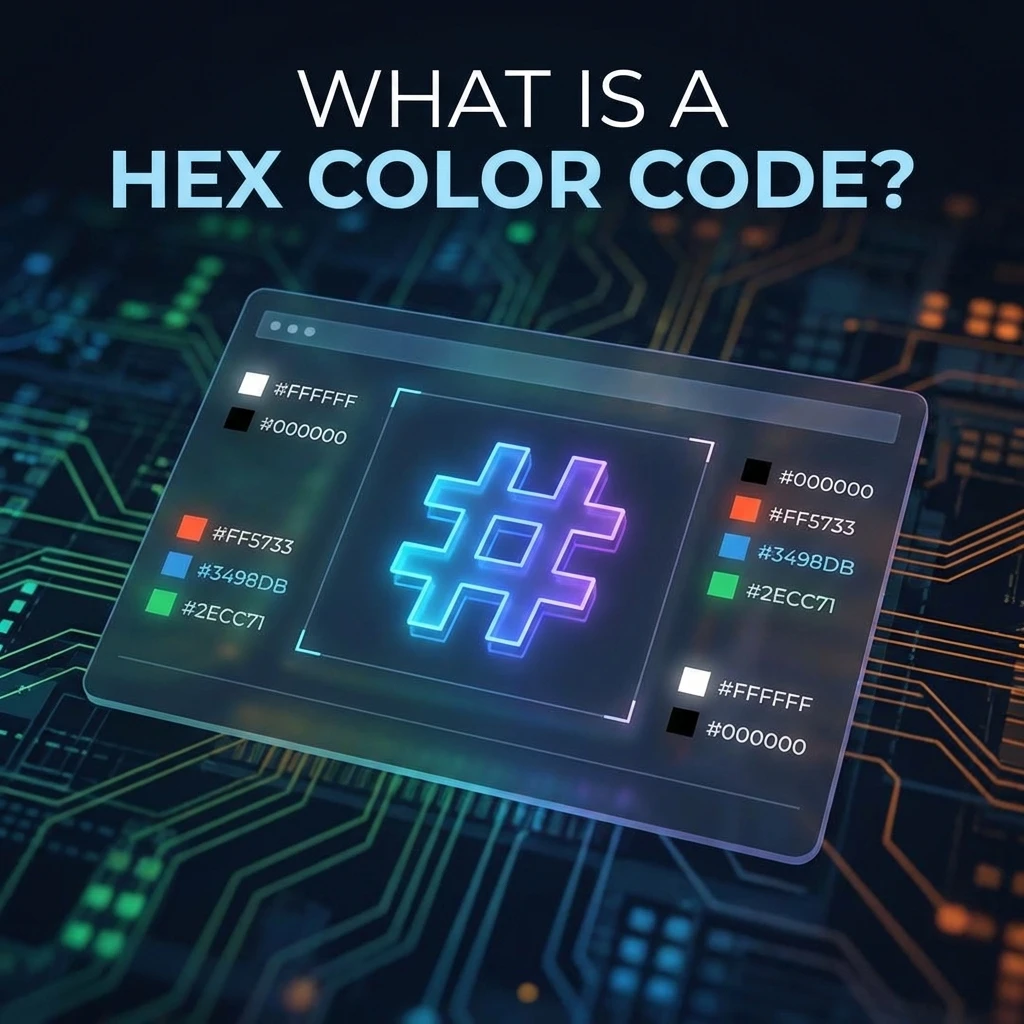
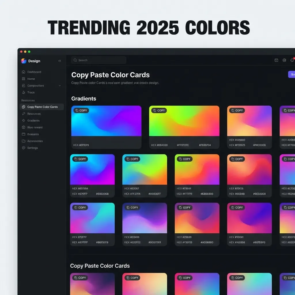
There is a secret, unspoken dictionary of specific hex codes that professional front-end developers use. They don't use the default colors. If you know these specific, popular codes, your UI instantly stops looking like a bootstrap template and starts looking significantly more expensive and premium.
The "off-black" typography secret
The single biggest amateur mistake in web design is using #000000. It creates a jarring, maximum 21:1 contrast ratio against stark white backgrounds. On modern, incredibly bright OLED and Retina displays, this contrast physically tires the human eye during long reading sessions. It creates a subtle halation effect where the white background bleeds into the black text, making it look blurry to users with astigmatism.
The dumb solution that works flawlessly is using "off-black" or "ink." My absolute default text color for every new project I spin up is #1A1A1A, #111827, or the slightly warmer #292524. These colors provide excellent, WCAG-compliant accessible contrast without the harsh, aggressive glare of pure black. I think swapping pure black for a sophisticated off-black is the single fastest, easiest way to make a junior developer's portfolio look instantly professional.
The "off-white" background necessity
The exact same rule heavily applies to backgrounds. Pure white (#FFFFFF) acts like a literal lightbulb shining directly into the user's face. If you look closely at high-end SaaS dashboards (like Stripe, Vercel, or Linear), their primary backgrounds are rarely pure white. They are actually subtle off-whites like #FAFAFA or #F3F4F6.
There's no clean native solution for making harsh, default colors look premium; the mandatory workaround is mathematically muting everything by about 2% to 5%. (I actually keep a dedicated snippet file of exact hex codes sampled from Stripe and Vercel just to reference their incredibly refined neutral gray scales when I'm setting up a new Tailwind config.)
The "safe" interactive blues
Blue is the absolute undisputed king of the internet. It is universally recognized as the color for clickable links, it carries almost no negative cultural baggage globally, and it is mathematically the easiest color to pass WCAG 2.1 accessibility checks with while using white text.
But not all blues are created equal. The default HTML blue (#0000FF) is toxic and burns the eyes. Facebook's classic #3B5998 feels incredibly dated to 2008. Twitter's old #1DA1F2 is a bit too bright for enterprise software.
The most popular, reliable interactive blues currently shipping in production are usually derived from heavily vetted design systems like Tailwind. If you need a safe, universally accepted, highly accessible primary blue for your buttons, #2563EB or #3B82F6 will never let you down. They are perfectly saturated, mathematically accessible, and instantly communicate "click me" to the user.
The semantic status colors
Finally, you cannot get creative with your semantic status colors. Users have been conditioned by thousands of apps to expect specific colors for specific system states.
For success states, never use a neon green. Use a grounded, readable green like #10B981 or #059669. For destructive actions (like deleting an account) or severe error states, avoid bright pink-reds and stick to a serious, authoritative crimson like #EF4444 or #DC2626. For warning states, yellow is notoriously difficult because white text on yellow fails contrast immediately. Use a deep amber or orange like #F59E0B and force the text color to black.
Stop guessing your core colors. Stop dragging the Photoshop color picker around until it looks "okay." Use #1A1A1A for your typography, use #FAFAFA for your core backgrounds, use #2563EB for your primary interactive actions, and respect the semantic status colors. Your UI will look professional immediately.