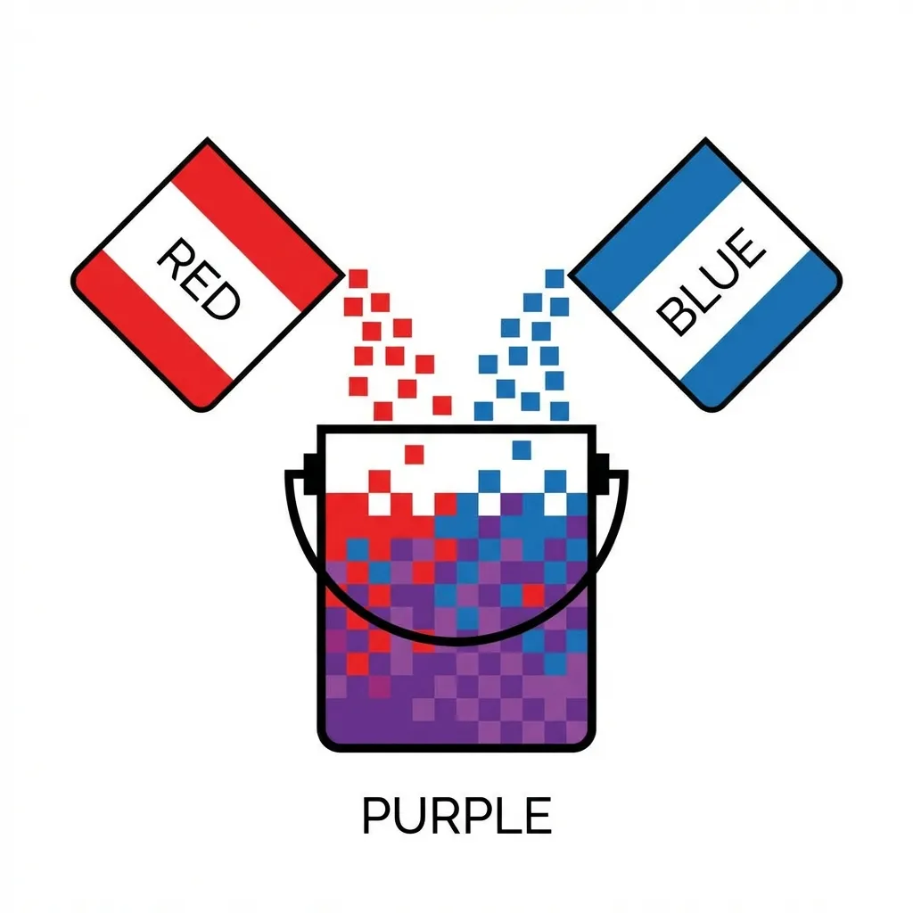
When I was first learning CSS in 2012, I desperately needed a muddy purple background for a website header. Because I didn't know the exact hex code, I tried to mix a pure blue variable and a pure red variable by literally placing two absolutely positioned divs on top of each other and setting the top one to 50% opacity. It looked like absolute garbage. The browser did not render a beautiful, deep purple. It rendered a muddy, washed-out, lifeless gray-purple.
Digital color mixing is fundamentally, mathematically different from mixing physical paint on a canvas. If you treat pixels on a monitor like physical pigments, you will get terrible, unexpected results every single time.
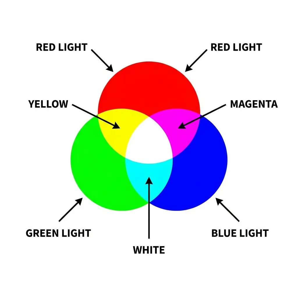
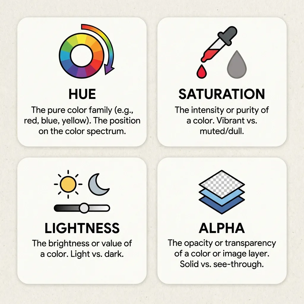
Additive light versus subtractive pigment
Physical paint is a subtractive color model (CMYK). When you mix blue paint and yellow paint on a physical palette, the pigments absorb light. The resulting mixture reflects green light back to your eye. If you mix enough paint colors together, they absorb absolutely all the light in the room, and you get black.
Digital screens are an additive color model (RGB). A monitor is just a massive grid of tiny, glowing flashlights. When you mix pure blue light (#0000FF) and pure yellow light (#FFFF00) on a screen, you don't get green. You get a blinding, weird, highly-saturated white-gray. If you mix all the colors together, you get pure, blinding white light (#FFFFFF).
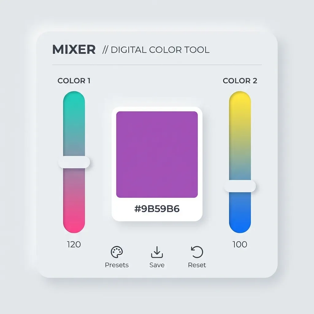
I think the absolute hardest part of front-end development is actively unlearning kindergarten art class. You have to stop thinking about what happens when you mix paint, and start thinking about what happens when you cross two laser beams in a dark room. The dumb solution that works is completely abandoning your intuition and relying entirely on the browser's native mathematical color-mix() function, which handles the exact light-wave calculations for you.
The terrifying sRGB "dead zone"
If you use color-mix(in srgb, blue, red), the browser engine draws a perfectly straight mathematical line between the blue coordinate and the red coordinate in the sRGB color space. Because the standard sRGB space is not perfectly, perceptually uniform to the human eye, the mathematical midpoint of that straight line often dips directly into a muddy, desaturated "dead zone."
This is why CSS gradients between two highly saturated colors often look terrible, possessing a muddy gray band directly in the center. The browser is technically doing the math correctly, but the human eye perceives the resulting mixture as garbage.
There is absolutely no clean solution for fixing this in standard RGB math; the mandatory workaround is switching your interpolation space from sRGB to OKLCH. Writing color-mix(in oklch, blue, red) forces the browser engine to calculate the mix based entirely on human optical perception rather than raw light output. The math literally curves around the color wheel instead of cutting a straight line through the muddy center. The resulting purple is vibrant, clean, and exactly what you expected.
(I actually spent an entire week rewriting a complex, interactive gradient generator tool for a client specifically to support the OKLCH color space, entirely because the standard RGB gradients looked so unprofessionally bad when mixing opposing colors.)
When to actually mix colors in production
You should almost never mix primary brand colors together dynamically in production. If your brand is blue and orange, do not mix them. You will get brown.
The only time you should be digitally mixing colors in CSS is when you are generating dynamic states. You mix your primary button color with 10% black to generate a hover state. You mix your text color with 50% transparency to create a muted sub-heading. You mix your background color with 5% of your primary brand hue to create a cohesive, tinted neutral gray.
Stop trying to guess the resulting hex codes for mixed colors in your head. It is a waste of time. Use color-mix() natively in the OKLCH space, define your percentages, and let the browser engine do the heavy lifting.