A marketing agency once handed me a massive folder of completely unedited, raw JPEG photos and confidently told me to "build the entire brand palette inspired by these vibes." They didn't give me a single hex code. They didn't give me a style guide. They literally just gave me pictures of mountains and expecting me to build a CSS architecture out of it.
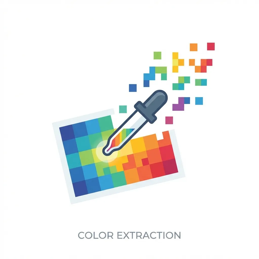
Extracting a usable, mathematically sound UI palette directly from a raw photograph is incredibly difficult because photos are inherently noisy. If you blindly use the eyedropper tool on a beautiful sunset photo, you will end up with an unmaintainable mess of muddy, inconsistent hex codes.
The dangerous pixel trap
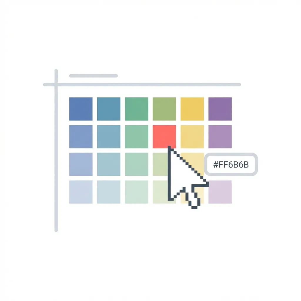
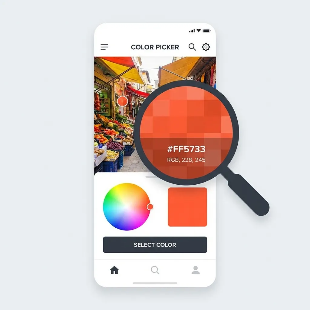
If you zoom closely into a beautiful, vibrant blue sky in a standard JPEG image, you won't actually find one single "blue." You will find thousands upon thousands of highly artifacted pixels ranging wildly from bright cyan to a dull, muddy gray. Clicking a single, random pixel with an eyedropper tool to establish your primary brand color is a terrible idea.
The dumb solution that works flawlessly is intentionally blurring the image before you sample it. When I am forced to extract colors from a mood board, I throw the photo into Photoshop or Figma and apply a massive, aggressive Gaussian Blur (usually around a 50px radius). This mathematically averages out the compression noise and the granular lighting variations, giving you the true, smooth, underlying hue of the object. Only after the image is heavily blurred can you safely use the eyedropper tool to grab a representative hex code.
Algorithmic palette extraction
If you don't want to use the blur trick, you have to rely on algorithms. When you upload a photo to an automated color palette generator, it doesn't just randomly pick pixels. It usually runs a "K-means clustering" algorithm.
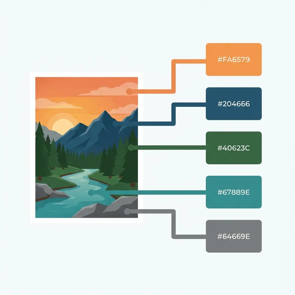
This algorithm scans the entire image, groups similar colors together into clusters, and then finds the mathematical center (the average) of the most prominent clusters. It is incredibly effective for finding the dominant colors in a complex photograph. (I actually spent an entire weekend building a Python script using the Pillow library to run K-means clustering on client images because doing it manually in Figma was driving me insane.)
Generating the scale from the extraction
Once you extract that core, dominant hue from the image, you must immediately stop extracting colors. Do not attempt to extract your hover states, your active states, or your neutral backgrounds from the photo. There is no clean solution to finding a mathematically perfect CSS hover state by clicking on a JPEG of a tree; the mandatory workaround is abandoning the photo entirely and jumping straight back into standard CSS math.
Take that single, algorithmically extracted hex code, convert it to the HSL color space, and generate your strict 10% lightness steps. If you extracted a deep forest green for your primary button, you drop the lightness by 10% to create the hover state. You do not go searching the photo for a darker green shadow to use as your hover state.
I think junior designers aggressively waste hours trying to pull an entire, fully functioning 5-color UI palette from a single photograph when all they really need to extract is the core emotional hue. Extract the primary color by blurring the image or using a clustering algorithm. Generate absolutely everything else mathematically using HSL. Your UI will look cohesive and professional instead of chaotic and noisy.