I completely tanked a client's e-commerce conversion rate in 2021 by changing their primary checkout button from a "boring" standard blue to an "energetic, highly-converting" orange. I genuinely thought the new color looked modern, fresh, and theoretically aligned with aggressive marketing psychology. The actual users thought the orange button looked like a spam warning or a destructive error. Conversions plummeted by 14% in three days, and I had to frantically revert the codebase over a weekend.
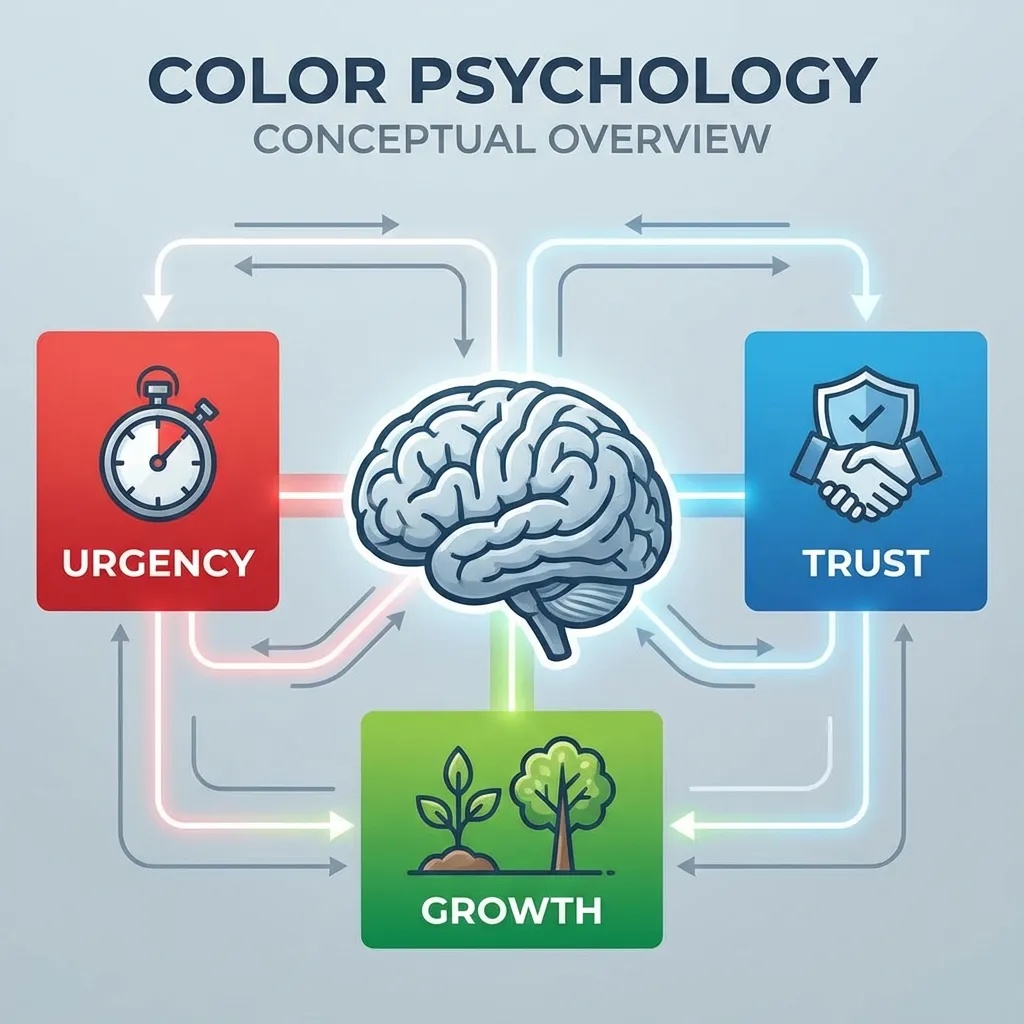
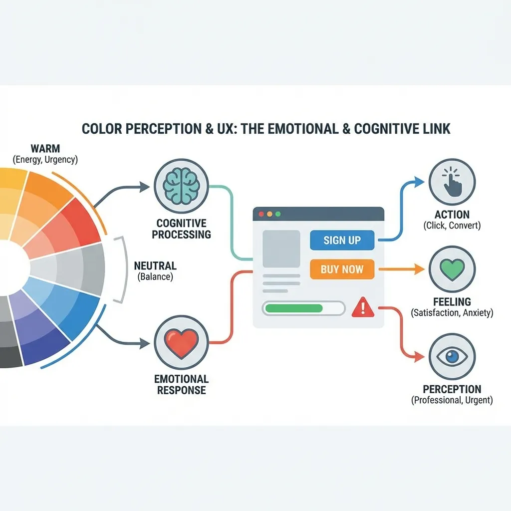
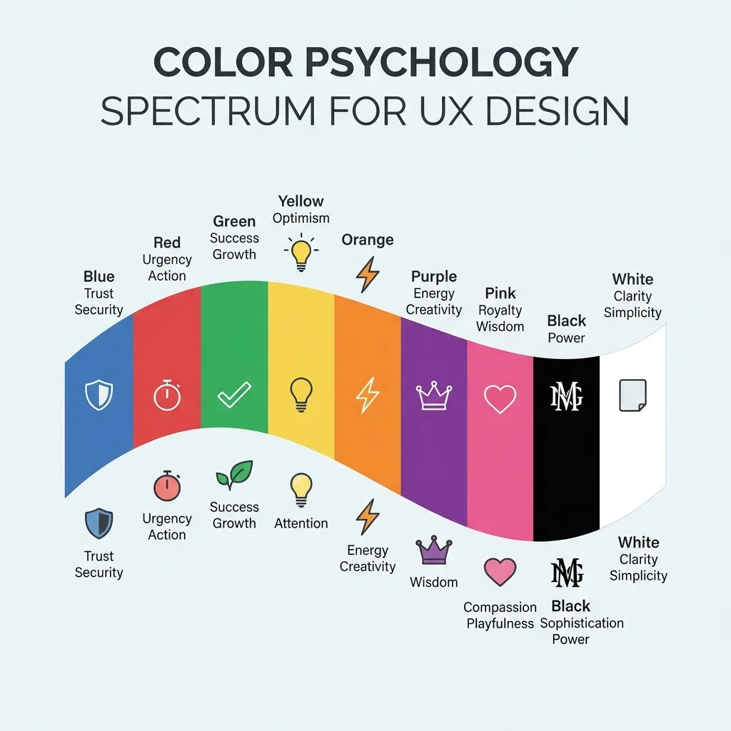
Color is absolutely not decoration. It is the primary, foundational method by which users navigate your interface before they ever consciously read a single word of text on the page. If you treat UI color like a blank canvas for artistic expression, you are actively sabotaging your software's user experience.
The massive cost of breaking UI convention
The hard truth of web development is that your users spend 99% of their time on other people's websites. They have been deeply conditioned by Apple, Google, and Microsoft to expect your software to work exactly like those massive ecosystems. If you try to reinvent the wheel with your color palette, you will fail spectacularly. Green universally means success. Red universally means error. Blue universally indicates an interactive, clickable element.
A junior designer I know recently built an incredibly beautiful, highly stylized dark mode application where all the primary navigation links were a muted crimson red. Visually, it was absolutely stunning and belonged on a Dribbble homepage. Functionally, the click-through rate was abysmal. Users subconsciously associate red text with validation errors, missing form fields, or destructive account deletions, not standard navigation. The dumb solution that works is relentlessly sticking to standard, established UI color patterns. Save your avant-garde creativity for the marketing illustrations and the landing page heroes, not the interactive application layer.
The very real problem of contrast fatigue
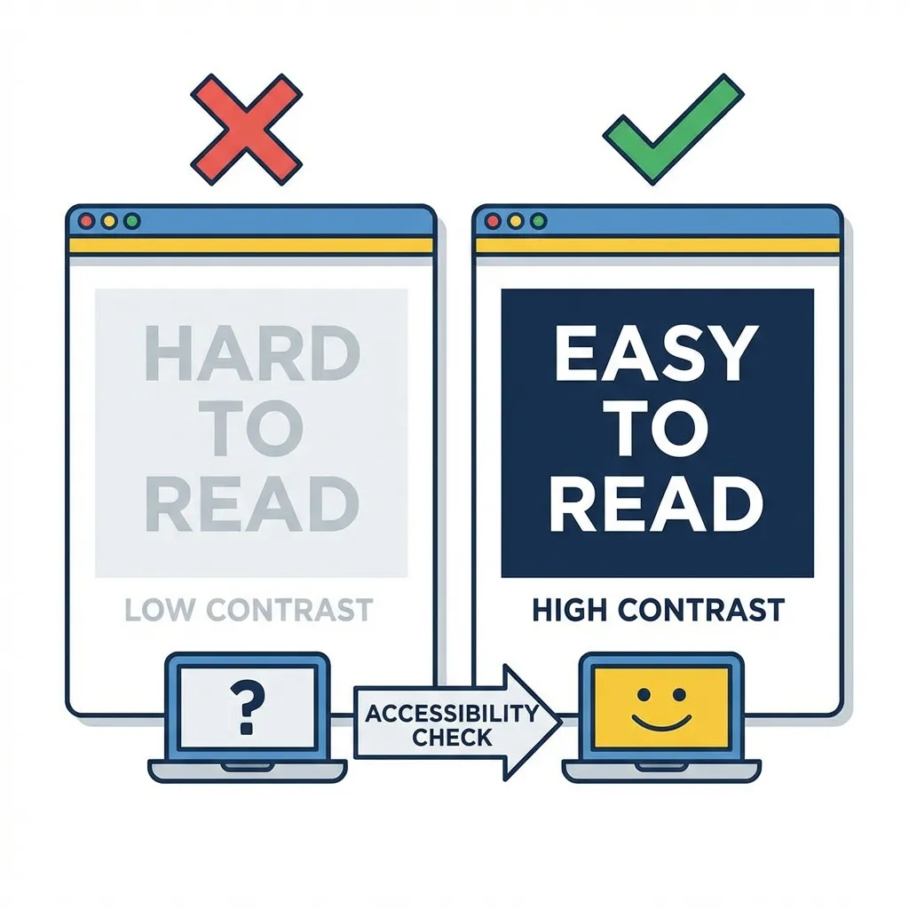
There is no clean solution to designing an interface for users who are forced to spend eight consecutive hours a day staring at your software; the mandatory workaround is aggressive, borderline boring visual restraint. If you use a stark white background (#FFFFFF) paired with pure black text (#000000), you are creating a maximum 21:1 contrast ratio that physically burns the user's retinas over long computing sessions. This causes a well-documented phenomenon called halation, especially in users with astigmatism, where the white light bleeds over the black letters and makes the text appear blurry.
I think the absolute best UX designers in the industry deliberately mute everything on the screen. Drop the primary background color down to a soft off-white like #FAFAFA. Lift the primary body text up to a dark gray like #1A1A1A. It is a tiny, almost imperceptible mathematical adjustment that actively prevents user migraines and significantly increases the time they can comfortably spend inside your application.
(I actually learned this specific lesson from an incredibly strict senior developer who flatly refused to approve any of my pull requests if I used pure white backgrounds in the main layout wrapper. It frustrated me at the time, but it fundamentally changed how I view accessibility.)

Handling semantic error states correctly
How you handle error states is the ultimate test of your UX color skills. Most developers simply change the border of an input field to #FF0000 and call it a day. This is a massive accessibility failure. Roughly 8% of the male population has some form of color vision deficiency (color blindness). If the only way you communicate an error is by changing the color of a 1-pixel border to red, those users literally cannot see the error. They will click "Submit" repeatedly and assume your application is completely broken.
Color must never be the only indicator of a system state. If you make a field red, you must also introduce a heavy icon (like a warning triangle) and explicit, bold helper text below the input field explaining exactly what went wrong. The color simply draws the eye; the typography and iconography actually solve the user's problem.
The myth of brand color dominance
Marketing teams will fiercely argue that the brand color must be the most prominent element on every single page of the application. They are wrong, and capitulating to them will ruin your UX.
If your brand color is a highly saturated, aggressive yellow, you physically cannot use it for primary buttons with white text because it violently fails WCAG 2.1 contrast math. You cannot use it for backgrounds because it causes immediate eye strain. The only acceptable place for an aggressive brand color in a functional UI is in tiny, concentrated accents: a thin active-state border on a navigation tab, a focus ring around an input, or the fill color of a specific SVG icon.
Stop trying to manipulate user emotions with psychological color theory. Manipulate usability instead. Ensure your contrast math is perfect, respect decades of established UI conditioning, and keep the interactive palette ruthlessly simple. The best user experience is the one the user doesn't even consciously notice.