When I landed my first major freelance contract in 2018, the client's marketing director proudly handed me a PDF containing their "official digital color palette." It was exactly three colors: a bright neon green, a blinding magenta, and pure white. I had to politely explain to him that he had handed me a logo color scheme, not a UI color palette. He didn't understand the difference, and it took a very awkward two-hour meeting to explain why I literally could not build his software without adding twenty more colors to the list.
A true UI color palette is not a mood board. It is not an artistic expression. It is a strict, highly structured, JSON-like database of mathematical variables that dictate exactly how the software communicates with the user.
The structure of a production palette
If you look at the source code of any modern, professional design system (like Tailwind CSS, Material Design, or IBM Carbon), a color palette is never just a list of five hex codes. It is a matrix.
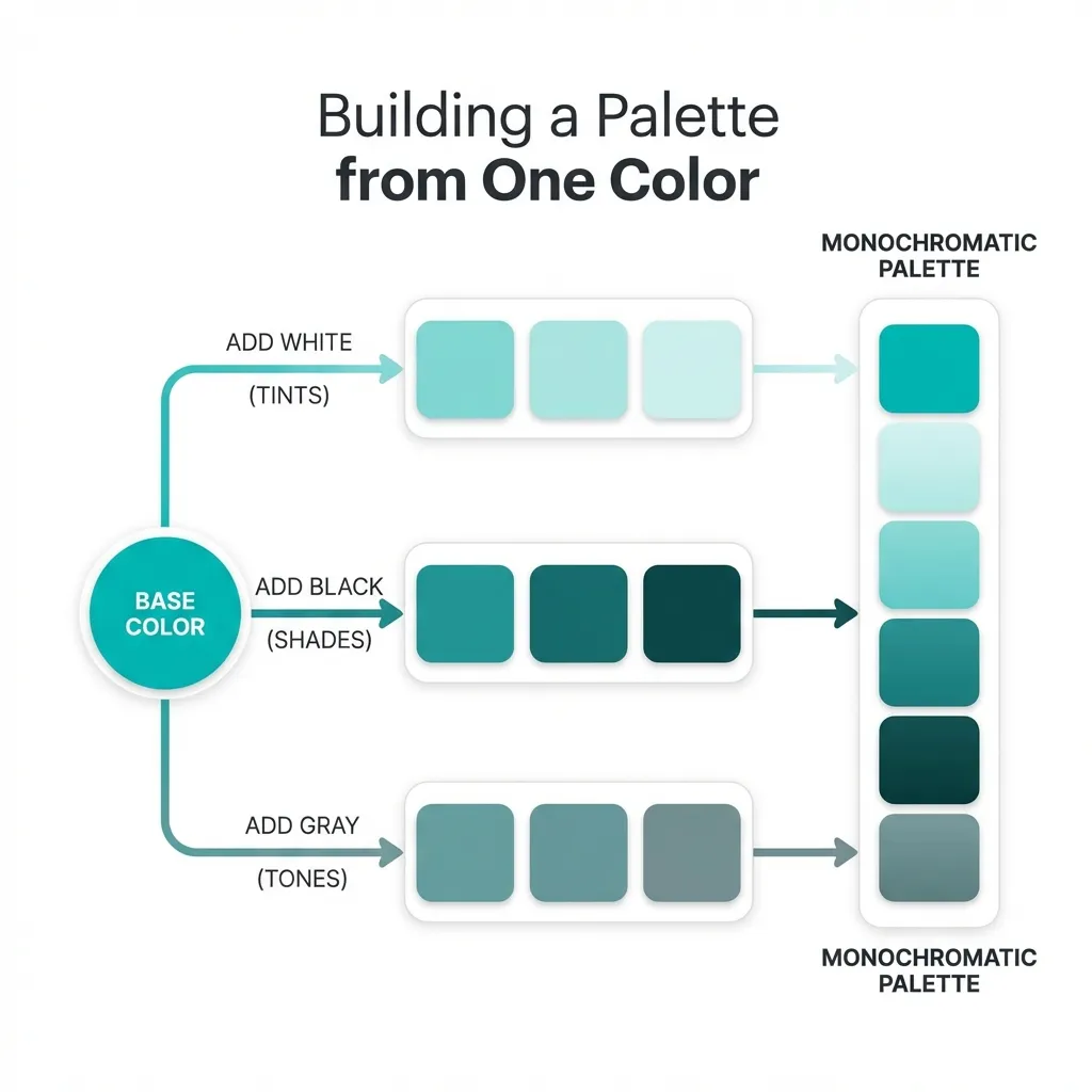
A professional palette is broken down into "hues" (like Blue, Red, Gray) and "steps" (usually 50 through 900). The "50" step is the absolute lightest version of the color, usually reserved for subtle background tints. The "500" step is the core brand color, used for primary interactive buttons. The "900" step is the deepest, darkest version of the color, used strictly for high-contrast typography.
The dumb solution that works is completely abandoning the idea of picking colors yourself and just adopting a pre-built 50-900 scale matrix. When I start a project, I don't drag a color picker around. I pick one core brand hue, and I use an algorithmic generator to instantly map out the 10-step scale. This guarantees that my hover states (usually the 600 step) and my active states (the 700 step) are mathematically flawless.
The semantic mapping layer
Having a beautiful 50-900 scale matrix is only the first half of a color palette. The second, more critical half is semantic mapping. This is where most junior developers create unmaintainable technical debt.
If you write background-color: var(--blue-500); directly on a button component, your palette is fundamentally broken. If the client rebrands to green next year, you have to find and replace every single instance of --blue-500 in your entire React architecture. It is a nightmare.
A proper digital palette uses two layers. The first layer defines the raw colors (--blue-500: #3B82F6;). The second layer assigns those colors a semantic job (--button-primary-bg: var(--blue-500);). Your components only ever reference the semantic job. This structure is what separates a pretty picture from a functional, enterprise-grade software system.
The necessity of the neutral scale
The most important part of your color palette is not your brand color. It is your gray scale. A typical web application is 85% gray. The borders, the backgrounds, the secondary text, the disabled buttons, the shadows—they all rely on a massive, highly structured neutral scale.
There's no clean solution to a UI that feels disjointed and cheap; the mandatory workaround is actively tinting your neutral gray scale with your primary brand hue. If your primary brand is blue, you must inject a tiny, 2% saturation of blue into every single gray in your 50-900 scale. It makes the grays feel intentionally designed and "cool," rather than looking like default browser styles.
(I actually spent three weeks trying to fix a dashboard that felt "off" before I realized the previous developer had used warm, yellow-tinted grays alongside a cold, stark blue primary color. The visual dissonance was actively hurting the design.)
Stop treating color palettes like art projects. Treat them like a database. Build your 50-900 scales. Build your semantic mapping layer. Tint your neutrals. Once the math is locked in, the UI practically designs itself.